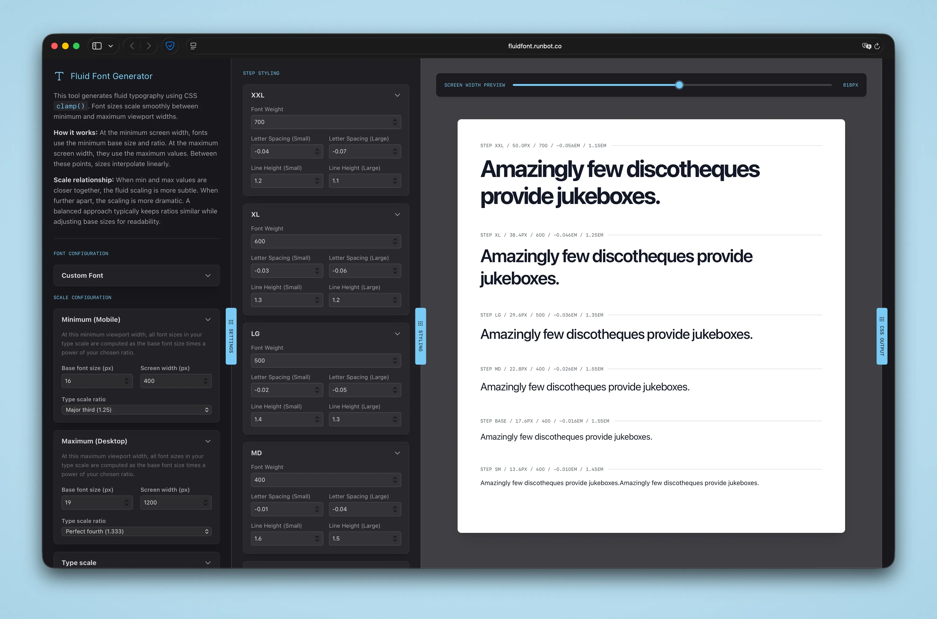
A while back, I wrote about using a single clamp() function to drive fluid typography and responsive grids. It’s a beautifully simple approach, you give your browser a flexible canvas, and your typography scales proportionally.
But I needed something to fine-tune the details. Existing fluid type calculators are fine for basic font sizes, but they ignore the nuances of setting actual type. I hated that I couldn’t test different fonts, toggle specific OpenType features, or generate multiple scale steps with precise control over responsive line-heights and letter spacings. Tighter leading looks great on a massive desktop headline, but it’s illegible on a cramped mobile screen.
So, I built the tool I needed. Go check it out at
fluidfont.runbot.co